
Why Japanese Websites Still Feel Like It's 2005 — And What It Will Take to Rectify Them
Reserved
·
January 10, 2024
·
12 min read

Japan builds bullet trains that arrive within seconds of schedule, manufactures some of the most reliable hardware on earth, and pioneered mobile internet adoption a decade before the rest of the world caught up. So why does logging into your Japanese bank account feel like navigating a government form from 2003?
This isn't a niche complaint. It's a systemic issue that affects millions of users daily — from residents managing their finances to tourists trying to book a train ticket. And it's costing Japanese businesses more than they realise.
At Reserved, we've spent years working at the intersection of Japanese business culture and modern web development. What we've observed isn't a lack of technical capability — Japan has extraordinary engineering talent. It's a structural and cultural pattern that keeps digital experiences trapped in a previous era.
The Problem Is Real — And It's Everywhere
Let's look at some of the most widely used digital services in Japan, not to criticise for its own sake, but to illustrate a pattern that repeats across nearly every industry.
Banking: SMBC Corporate Online
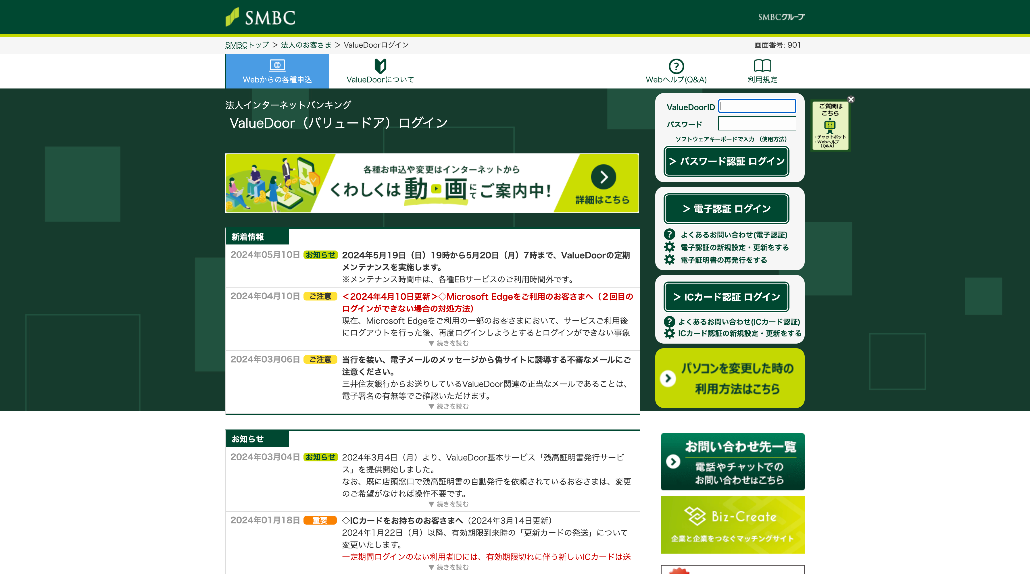

Sumitomo Mitsui Banking Corporation is one of Japan's "Big Three" megabanks, serving millions of corporate and retail clients. Yet the corporate banking portal features dense tables of text, inconsistent UI patterns, tiny click targets, and navigation that requires prior training to use effectively. There's no visual hierarchy guiding the user — everything is presented with equal weight, which means nothing stands out.
Investing: SBI Securities
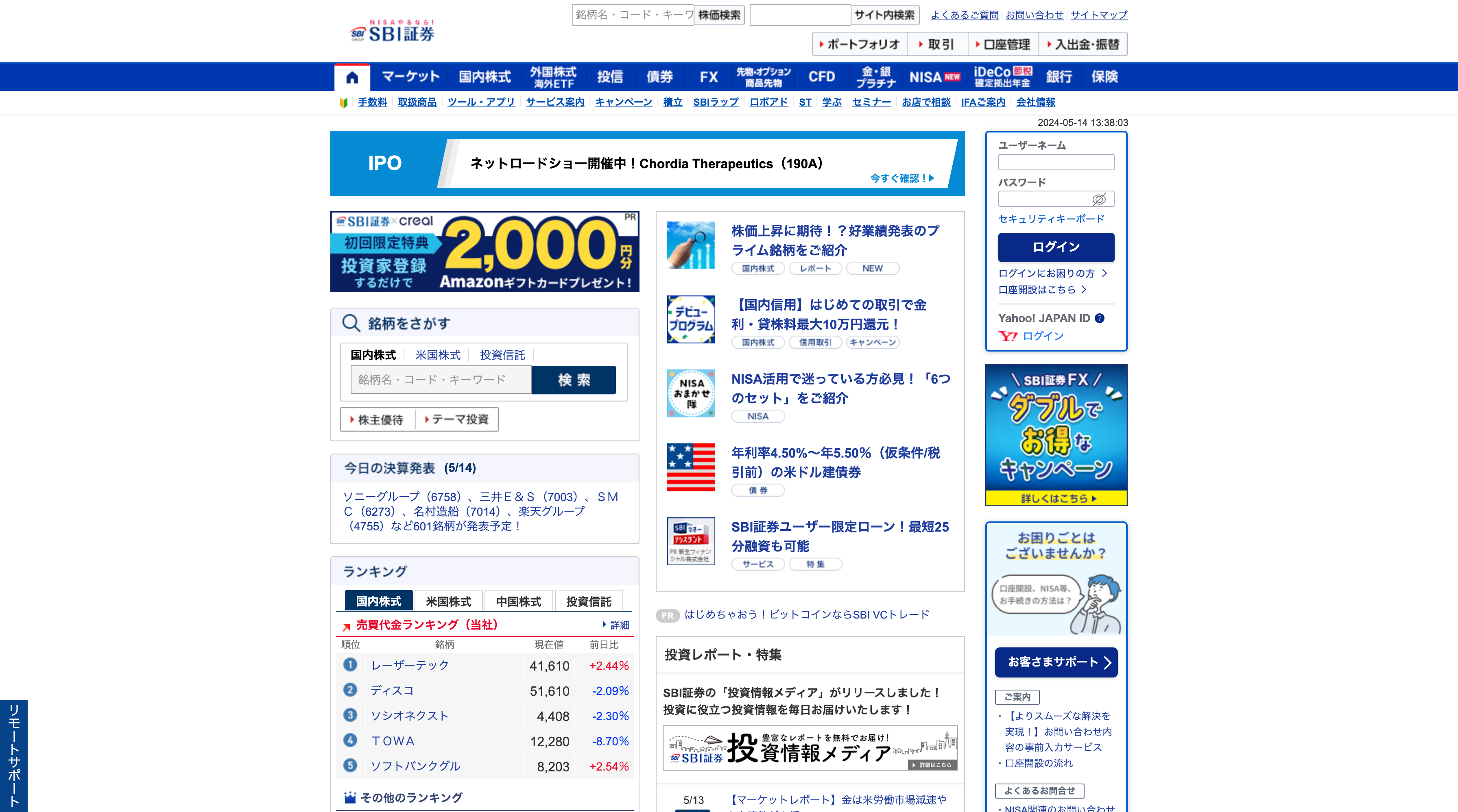

SBI Securities is Japan's largest online brokerage by account numbers. The trading interface is a wall of data — stock tickers, news feeds, charts, menus, and promotional banners all competing for attention on a single screen. For a first-time investor, this isn't informative — it's intimidating. The information density actively discourages the behaviour the platform is supposed to encourage.
Travel: ANA Award Booking

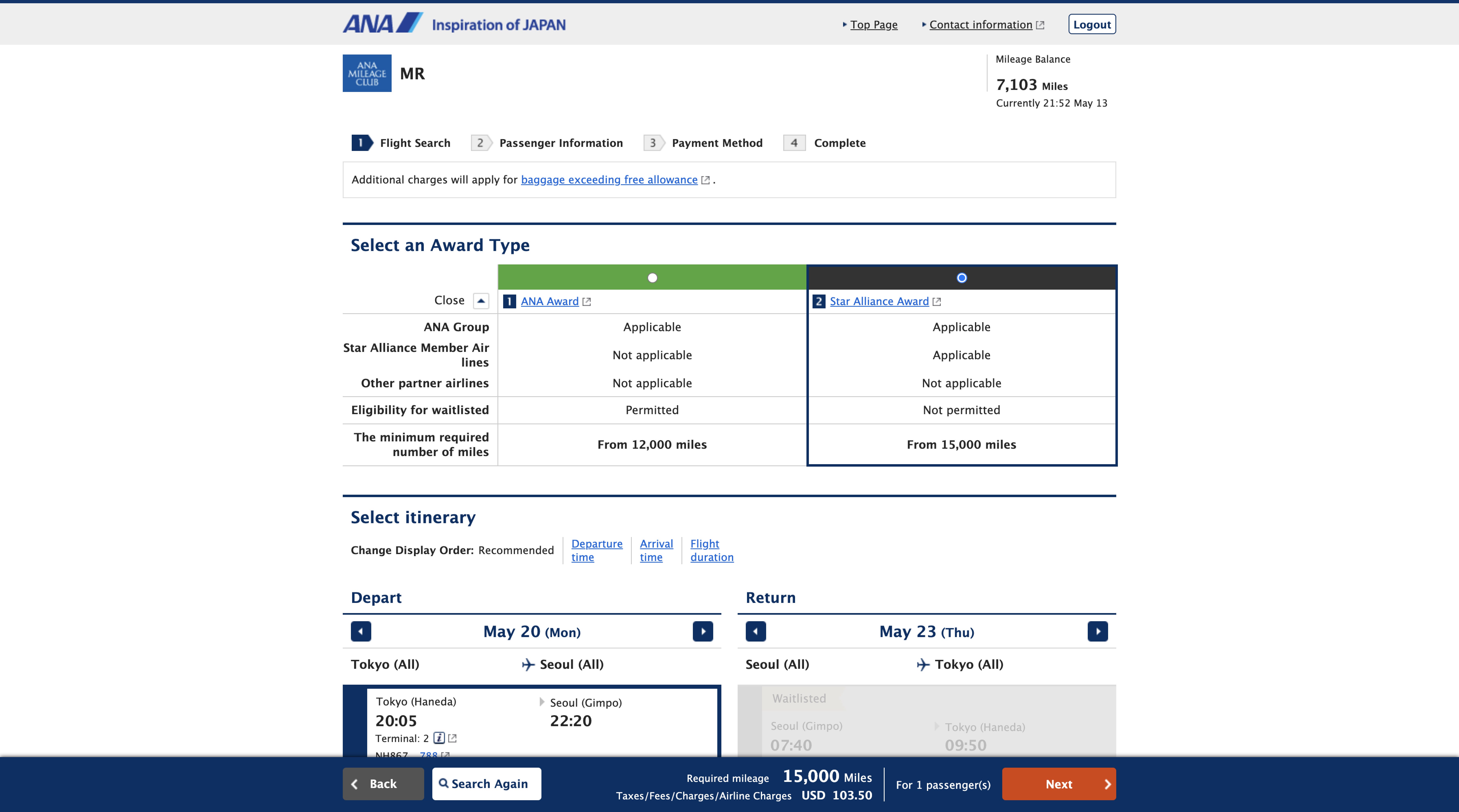
All Nippon Airways is a 5-star airline by Skytrax standards — world-class service in the air, baffling experience on the web. The award flight booking flow involves multi-step forms with unclear validation, calendar interfaces that don't communicate availability intuitively, and error messages that send you back to step one. For international travellers unfamiliar with the conventions, it borders on unusable.
Tourism: Japan National Tourism Organisation (JNTO)
This is the official gateway for international visitors to Japan — and it looks like a site designed by committee in 2010. The layout is cluttered, the information architecture is flat (everything is surface-level with no clear user journeys), and the mobile experience is an afterthought. For a country that welcomed over 36 million visitors in 2024 and is aggressively targeting 60 million by 2030, this is a missed opportunity of staggering proportions.
Why Does This Keep Happening? Understanding the Japanese Approach
Having worked extensively with Japanese businesses, I can say with confidence: this is not a technology problem. Japan has the infrastructure, the talent, and the budget. The roots are cultural, organisational, and structural — and understanding them is essential before you can fix anything.
1. Consensus Culture (根回し / Nemawashi) Kills Bold Design Decisions
Japanese corporate decision-making relies heavily on nemawashi — the practice of building consensus among all stakeholders before a decision is formally made. In product development, this means every department gets a say in what appears on screen. Marketing wants banners. Compliance wants disclaimers. Sales wants promotions. Customer service wants FAQ links.
The result? Every stakeholder's request gets accommodated, and nobody's gets prioritised. You end up with a page that serves the organisation chart, not the user. In Western product teams, a strong product manager or design lead would push back and enforce hierarchy. In many Japanese organisations, that kind of pushback is culturally discouraged.
2. Risk Aversion Favours the Familiar Over the Better
Japanese business culture has a deep-seated aversion to failure — the concept of 失敗は許されない (failure is not permitted) runs through corporate DNA. Redesigning a banking portal that millions of people use carries enormous perceived risk. What if users complain? What if something breaks? What if regulators notice?
The safer path is always incremental change: add a feature here, patch something there, but never fundamentally rethink the experience. This is why many Japanese platforms look like they've been continuously added to for 15 years without ever being redesigned. Because that's exactly what happened.
3. The "More Information = Better Service" Philosophy
There's a deeply held belief in Japanese service culture that providing more information is a form of respect and thoroughness (丁寧 / teinei). Leaving something out might be seen as negligent or incomplete. This principle works beautifully in Japanese hospitality — the meticulous attention to detail in a ryokan or a kaiseki meal is world-renowned.
But on a screen, this philosophy produces the opposite of its intent. When everything is shown, nothing is findable. Information density that signals diligence in a physical context creates cognitive overload in a digital one. The most helpful thing a digital interface can do is hide complexity until it's needed — and that's a fundamentally different design philosophy from what Japanese service culture instinctively defaults to.
4. Legacy Systems and Vendor Lock-In
Many of Japan's largest companies — banks, airlines, telecoms, government agencies — run on systems built during the IT boom of the late 1990s and early 2000s. These aren't just old designs sitting on top of modern infrastructure. The frontend, backend, and database layers are often tightly coupled legacy systems maintained by the same systems integrator (SIer) that built them two decades ago.
These SIers — companies like NTT Data, Fujitsu, and NEC — operate on long-term contracts that prioritise stability and continuity over innovation. Switching vendors or rebuilding from scratch is seen as prohibitively risky and expensive, so platforms get patched and extended indefinitely. The web interface is often literally a thin skin over a mainframe.
5. Mobile ≠ Modern
Japanese mobile apps are generally better than their web counterparts — cleaner layouts, more modern UI patterns, faster performance. But "better than the web version" is a low bar. Many Japanese apps still suffer from:
- Screen clutter — cramming multiple services, promotions, and navigation options into a single view
- Deep linking to external services — tapping one thing opens a browser, which opens another app, which requires a separate login
- Inconsistent design language — different sections of the same app looking and behaving differently, because they were built by different teams or vendors
Compare this to the global standard set by companies like Apple, Stripe, or Linear — where every interaction is considered, every screen has a clear purpose, and the design language is ruthlessly consistent.
The Business Cost of Bad UX
This isn't just an aesthetic issue. Poor digital experiences have measurable consequences:User abandonment. Research from Google shows that 53% of mobile users abandon sites that take longer than 3 seconds to load. But speed is only part of the equation — confusing interfaces cause abandonment even on fast sites. If a user can't figure out how to complete a booking or a transaction within 2–3 attempts, they leave.
Lost international opportunity. Japan is actively courting foreign investment, tourism, and talent. But when a tourist can't navigate the official tourism website, or a foreign business can't figure out a bank's onboarding portal, the message — intentional or not — is: this isn't built for you.
Competitive erosion. Japanese fintech startups like PayPay and neobanks are already demonstrating that modern UX wins users. Every day the incumbents wait to modernise, these challengers capture more of the market — not because they offer fundamentally different services, but because they offer fundamentally better experiences.Internal inefficiency. Bad UX isn't just customer-facing. Internal enterprise tools in Japan — HR portals, expense systems, inventory management — often share the same design problems. This means employees waste hours each week navigating systems that should take minutes. Multiply that across thousands of employees and the operational cost is enormous.
What "Good" Actually Looks Like
The fix isn't westernisation for its own sake. It's about applying universal principles of usability while respecting the context:
Visual Hierarchy
Not everything can be priority one. Effective design guides the eye — using size, contrast, spacing, and colour to signal what matters most on any given screen. The goal isn't to remove information, but to reveal it progressively based on what the user is trying to accomplish.
Task-Oriented Design
Every screen should answer one question: what is the user trying to do right now? A banking dashboard should surface account balances and recent transactions, not 40 links to services. A booking flow should move linearly from search → select → confirm → pay, with no dead ends or ambiguous branching.
Consistent Design Systems
The best digital products are built on design systems — documented libraries of components, patterns, and rules that ensure consistency across every screen and every team. This is how companies like Shopify (Polaris) and Atlassian maintain coherent experiences across massive product surfaces. Most Japanese enterprise applications don't have design systems. They have accumulated decisions.
Performance as a Feature
Modern frameworks like Next.js deliver sub-second page loads through server-side rendering, static generation, and intelligent code splitting. These aren't just technical achievements — they're UX improvements. A page that loads in 800ms feels responsive and trustworthy. A page that loads in 4 seconds feels broken, no matter how good the design is.
Accessibility and Internationalisation
Japan's ageing population makes accessibility especially critical — larger touch targets, higher contrast ratios, screen reader compatibility, and clear typography aren't optional. And for any platform serving international users, proper internationalisation (i18n) — not just translation, but locale-aware formatting, right-to-left support where needed, and culturally appropriate design patterns — should be foundational.
What We're Doing About It at Reserved
We founded Reserved in Tokyo because we saw this gap firsthand — and we believed we could help close it.Our approach isn't to parachute in with a Silicon Valley playbook and tell Japanese companies they're doing it wrong. It's to combine deep respect for Japanese business context with modern design and engineering standards that have proven effective globally.Concretely, this means:
- Bespoke design, not templates. Every interface we build is designed from scratch for the specific users and business context. No themes, no generic layouts, no "this worked for another client so let's reuse it."
- Modern tech stack. Next.js, TypeScript, React — the same tools used by the world's best digital products. Server-side rendered, edge-deployed, and built for performance.
- User research and testing. We don't design based on assumptions or stakeholder wish lists. We test with real users, measure outcomes, and iterate.
- Progressive information disclosure. We design interfaces that surface what's needed when it's needed — respecting the Japanese value of thoroughness while preventing cognitive overload.
- Bilingual and international-ready. As a Tokyo-based team working across 5+ countries, we build natively for both Japanese and international audiences.
A Message to Japan's Enterprises
We know many of the companies mentioned in this article have talented in-house development teams. We're not suggesting they don't know what they're doing technically. The challenge is rarely individual competence — it's organisational momentum, legacy constraints, and the difficulty of advocating for bold change within consensus-driven structures.That's exactly where an external partner adds value. We can:
- Audit existing digital experiences with fresh eyes and benchmark against global standards
- Prototype modern alternatives quickly, giving stakeholders something concrete to evaluate rather than debating in the abstract
- Implement incrementally — you don't have to rebuild everything at once. Start with one user journey, prove the impact, and expand from there
- Bridge the cultural gap between Japanese organisational norms and international UX expectations
Japan's digital experiences don't need to look like Silicon Valley's. They need to feel as considered, precise, and world-class as every other aspect of Japanese craftsmanship already does. The standard is right there — it just hasn't been applied to screens yet.
The gap between Japan's physical service excellence and its digital experience is one of the biggest untapped opportunities in the market today. If you're a Japanese business ready to close that gap — or an international company operating in Japan and frustrated by the status quo — let's talk.